Labels are useful. They offer a shorthand view of what lies beneath. When applied to people, they encapsulate identities, worldviews. When applied to packaged foods, they convey nutritional quality, expiration dates, an origin story.
But, as we know, labels can also be harmful. They elide complexity, collapsing what is multifaceted into something flat. Canned foods, as the first packaged foods, have a long history of labels—both useful and, potentially, harmful.
When canned foods first came on the scene in the early nineteenth century, there was huge variation in how they were labeled. There was no standardization, and individual canneries put just enough on the containers to indicate what was inside. The development of lithography in the 1880s brought changes. While it didn’t at first lead to standardization, it did pave the way for commercial art. This allowed can labels to convey meaning not just through text, but also through images. As canners struggled to build a market for the still-unfamiliar and not-yet-trustworthy canned foods, canning companies began to illustrate their cans with evocative scenes. Cans’ opacity was two-fold: consumers literally couldn’t see through the metal walls to understand what was inside, and they also wrestled with the metaphorical opacity that obscured the process by which food was made non-perishable. Consumers of this time did not yet trust canned, packaged, and processed food. Before canning, food—once picked or harvested or fished or slaughtered—quickly spoiled or decayed. Perishability was expected. Thus, when consumers were confronted with canned milk, months from its date of origin, or with canned oysters, a thousand miles from the ocean, they had a hard time making sense of this new food production system.
Labels offered a way around this opacity. They could present an image of what lay beneath, a “window into the can.” They promised the same transparency into a changing and increasingly complex food system as many consumers seek today. As Charlotte Biltekoff explores in her post, transparency can build trust or “lift the veil.” So, too, have canners used labels to create a way for consumers to believe in the can’s content and production process.
The vision that this window has offered has changed over canned food’s history, as consumers’ doubts and concerns have changed alongside a morphing food landscape.
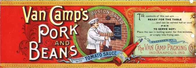
Four sets of can labels, from the G. W. Hume Company of San Francisco—from 1888, 1911, 1920, and 1933—illustrate some of these changes. The following descriptions and images of the can labels can be found in the September 30, 1933 issue of the Canner trade journal.
In 1888, the Hume Company’s Solano Brand White cherries had a label overflowing with California imagery: “a gleaming group of ripe cherries, a cherry orchard with a cannery in the background and a freight train puffing by in the foreground, a clump of tall trees,” along with a “variety of floral decorations.” The words “packed in Solano Co. California” were prominent. Although picturesque, the label did little to communicate the actual contents of the can or how they might be put to use.
As historian Ann Vileisis argues in Kitchen Literacy, as canned foods furthered the disconnect between producer and consumer that emerged in the late nineteenth century, the labels offered places of origin as “marketing referents.” The scenes from which these cans emerged became almost as important as their contents. But as American consumers grew accustomed to the unknowability of their food’s origins, these place-oriented label images became less common. By 1911, the Solano cherries’ label featured only a compressed outdoor scene, and by 1920, no agricultural scenery at all could be found. The place of origin mattered less. Consumers no longer feared that disconnect to the same extent, and therefore canners no longer needed to offer the same reassurance of where the food came from. In 1933, the Hume company released a new line of “modern” labels, which made clear the primacy of brand names and appetite appeal and established trust in an anonymous national food system. These factors had become central by the 1930s, in a stark shift from the place-based advertising of the 1880s.
The Hume company’s Yellow Cling Peach label of 1933 showed only two peach halves in an “attractive glass bowl,” displayed realistically as they would be served within the home. No trees, no leaves, no canning factories or freight trains. What came before the canned peaches’ entry into the consumer’s kitchen was not of concern. The large letters S-O-L-A-N-O were front and center, with hues of red and delicate green highlighting the brand name.
As federal regulations like the 1906 Pure Food and Drug Act and its replacement, the 1938 Federal Food, Drug, and Cosmetic Act, emerged, canned food labels began to feature more informational text about contents, size, additives, and statements of identity. This emphasis on “objective” information followed from broader trends in American history toward standardization and regulation, toward the quantification of nutrition with the discovery of vitamins and the rise of nutritional science, and toward the primacy of scientific information more generally.
Although these Acts may have shifted some of the label real estate toward more informational text, the subjective appeal of the label persisted. Throughout the 20th century, and into the 21st, food companies have remained keenly aware of the power of the images they present to the consumer.
To give one recent example, Campbell’s Soup Company released a new label in 2010. This time, though, the re-design was based not only on focus groups or graphic design best practices, but on a new innovative yet invasive method called “neuromarketing.” This controversial tool uses brain-imagine technologies to capture consumers’ unconscious emotional responses.
Based on the findings of this expensive research venture, Campbell’s redesigned label featured a steaming bowl of soup with no spoon hovering over it, and the icon red-and-white logo moved to the bottom of the can.
The neuromarketing findings had revealed that consumers felt “more emotionally engaged” by steam and its attendant idea of warmth, “had little emotional response” to the spoon that had previously been in the foreground, and found the various types of soup harder to differentiate when the Campbell’s logo was at the top of the can.
While it’s not clear how much of a transformation this redesign actually offered, it is clear is that the Campbell’s Soup Company was willing to pull out all the stops to come up with the “perfect” label, digging deep into the brain chemistry of willing participants to come up with some magical formula that would push the “buy-me” button in consumer’s brains.
The food label has remained central from the beginnings of our industrial food system. As food came to be packed in opaque cans, boxes, and bags, it could no longer speak for itself. The package, the label, had to tell the story. That story, like all stories, has been one crafted by the storyteller to meet particular ends, against a changing historical backdrop.
Labels offer an always-mediated window into the can.